Helping office hours TAs with data visualizations and consistency
Project Team
OVERVIEW
Queue Me In
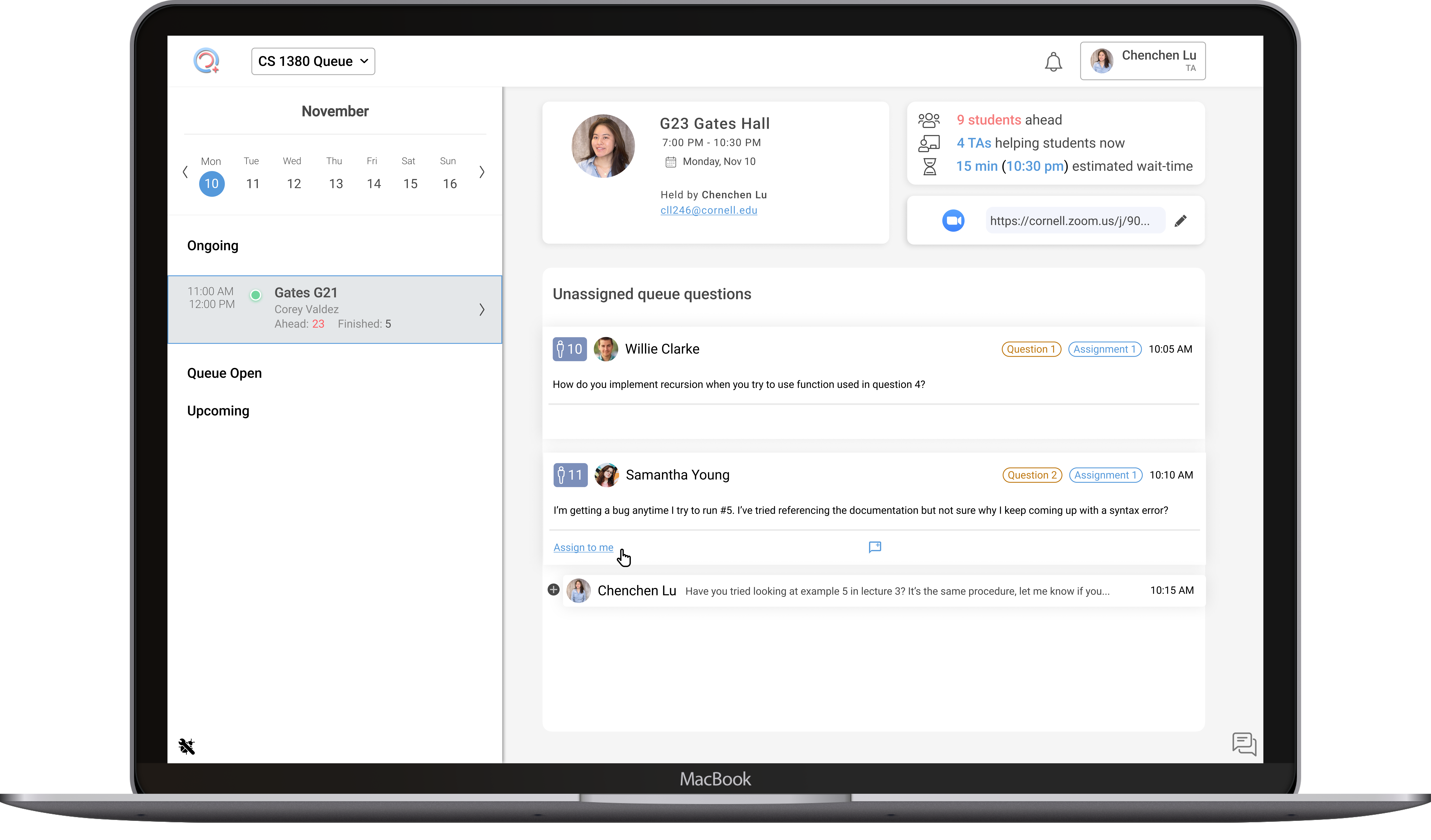
↳ Queue Me In (QMI) is an office hours platform used by thousands at Cornell and Stanford. It features a queue system that helps students get TA help, regardless of class format. QMI is developed by student designers, engineers, and PMs.
As Product Manager, I aimed to expand QMI's use beyond CS classes. I led UX research across various subjects, gaining insights for new features and rebranding.
Our efforts resulted in a 33% increase in classes, 3,000 new users, 14,000 sessions, and adoption by Stanford University.
2 Problems
QMI is only being used by CS classes.
TAs are having a hard time scheduling office hours, and are confused as to which page they are on because of inconsistent navigation and affordances.
Business Goal
To continue expanding growth, QMI needs to be prepared to handle different types of classes with differing needs.
Simplifying scheduling office hours reduces work on our end to teach classes how to use our software and lowers the barrier to onboarding more classes.
2 Solutions
Redesign pages with consistent navigation and affordances for each class modality and user type.
Simplify and visualize creating OHs using a calendar.
WHAT IS QUEUE ME IN?
The online queue is QMI's original feature.
The "Queue" is QMI's main feature, showing students waiting for TA help.
It's ideal for one-on-one help in CS classes, but other classes (like language and chemistry) need different communication methods.

PROBLEM #1
The navigation bar is inconsistent

The queue page of the class; a professor will see students waiting to be helped.

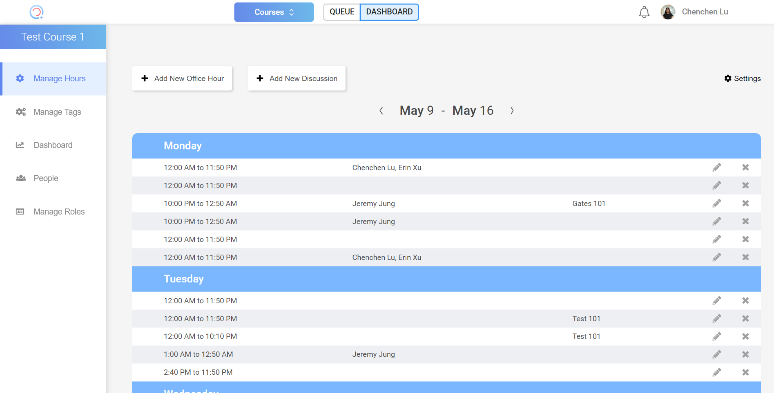
The dasboard page; a professor sees logistical information about the course.

The UI for a profile drop-down.
You can see:
- misleading affordances (the up and down arrows aren't clickable)
- content mismatch (the user's role [i.e. "PROF"] is shown next to the class but should be related to the profile)
- unscalable (this design assumes that QMI will only ever have one feature)
- random visual design and identity (no clear brand and visual inconsistencies)
SOLUTION
Allowing users to navigate between classes and class-specific features
Navigation should be consistent and clear, display multiple features and a dashboard per class, and still have it look put together visually.
After many, many iterations, and weekly critique sessions, I finally came up with a design that solves all these issues.
The user can now switch between classes, each feature, and their dashboard with one drop-down in a consistent location, making it easy for the user to always find. The class features are indented so there is a clear hierarchy.
The profile now lists the role of the user and follows a similar visual format to the other drop-down for consistency.
PROBLEM #2
TAs have difficulty reading and scheduling office hours.

TAs reported confusion with scheduling office hours.
- The general view is unclear as to which types of features the office hours are scheduled for
- The menu on the left is unclear as to which features it addresses
- The setting is also unclear as to which features it is for
- Visually, the long and vertical calendar format makes it hard to see more than just two days of office hours
- The long and vertical format requires a lot of physical scrolling
SOLUTION
Calendar view office hour visualization and interactions
After a ton of iterations and feedback from others, here are the changes made in the final version:
- Using 6-hour calendar chunks helps visualize office hours and shows all details despite conflicts. The block can expand as needed.
- Adding an office hour uses a space-saving drop-down menu, matching the new navigation. Editing is simple with a hover-activated pencil icon.
- Pills indicate office hour types, revealing trends and informing adjustments.
- The clean modal lists all settings.
- The left navigation has detailed subheaders.
RESULTS
QMI expanded to 16 classes, 3k users, and 14k sessions, and was adopted by Stanford University!
The future of QMI:
- continue research with all types of classes to see what we can expand into
- add new features to support those different classes
- onboard more Cornell & Stanford classes
- continue assisting Stanford with QMI
- expansion to other universities (like Stanford)!
LESSONS
The importance of a great team
I juggled multiple roles on several different teams all at once, making me realize how crucial how efficient and communicative teams must be.
Team dynamics
Group dynamics are crucial! We had issues with design communication, so we created detailed handoff documentation for clarity and a single source of truth. This improved teamwork and led to a great semester!
Juggle multiple roles
In my second semester at DTI, I was a product manager and designer for QMI, and also designed for another DTI product. Working with multiple teams and products improved my business thinking and time management. The skills and experiences made me a well-rounded designer!


